As a part of
our very first Compositing Class, we were introduced into the very basics of
composition. We were shown various examples of work that had been photoshopped
well, and others not so well, so we were able to give constructive criticism
back as a class.
As a part of a
homework task, we were required to find various images that we were able to
analyse, by speaking about how the image works, or how it doesn't, by
mentioning its composition.
We were
required to do this, by posting it on the university digital forum, for our
fellow students and friends to be able to see, and discuss.
As I am NOT
an expert at Photoshop or Compositing for that matter, It was a challenge as I
had to analyse more as a compositor other than just an opinion of a general
audience.
The forum post
that I made can be found via the link below, But I'm also posting it as a part
of this blog, for the reason I can keep track of my progress as I go along this
course.
http://www.staffs.ac.uk/forums/phpBB3/viewtopic.php?f=1130&t=13949
------------------------------------------------------------------------------------------------------------
This image,
is a composition by Martin de Pasquale from Argentina.
Although it’s
obviously an image that has been edited through photoshop, it’s fair to say
that it has been done rather convincingly. The scenario involved in the image
is highly unrealistic, but has been composed in a way that makes it look
somewhat real.
Looking
closely, you can see that the shadows have been replicated to the same angle
and size as the ones from the original image, to ensure that image is
convincing.
When
inspecting the arm laying on the table on the left hand side, you can see where
he has deliberately ensured that the lighting is similar, and ensured that the
exposure is similar to how the table is underneath.
One issue
personally that I have with the composition, is that the battery on the table,
requires a slight reflection of the light that’s coming in from the left. As
it’s looking rather dull, and slightly unrealistic.
On the whole,
for a scenario that is completely unrealistic, he has done a fairly convincing
job of making it look real.
This image
for me personally, is a pretty decent example of how a photograph can be
misleading even though it is raw without any editing.
This person
has made clever use of his laptop screens to convey the background images of
his photo, making it appear that the laptops are almost see through.
Looking
closely, you can see that he even went into the detail of including the candle
on the last but one laptop screen, to ensure it joined the real candle in the
background. Also the same trick repeated on the teapot behind.
Although a
very clever photo, It does have it’s giveaway’s for example, on the second
laptop screen, you can see where the duvet doesn’t connect with the actual
background, which shows that the laptop is displaying a picture, rather than
being see-through.
On the whole,
a clever photograph, and proves that not always does it have to be photoshopped
to be interesting or misleading.
Here is
another example of work by Martin De Pasquale from Argentina.
Again this
image contains a highly unrealistic scenario, but again composted to the extent
that it’s a convincing image and looks rather real.
You can see
where Martin Pasquale has paid attention to the lighting, and shadows to ensure
that the mouth thats ‘supposedly’ bulging from his stomach is indeed within
context with the rest of the image. The further right the image goes, you can
see where the lips has darkened and blends seamlessly into the rest of his
body. Therefore although we know it can’t be real, it does indeed seem real
because of the detail of editing he has gone into.
Overall I
would say it’s another successful image from this digital artist, and I can
safely say being a student , I finally understand the scenario he is trying to
convey!
After doing
some of the Photoshop tutorials on the Lynda Website, I decided to find some
images on the internet that I liked, and composited them into a one single
image.
The original
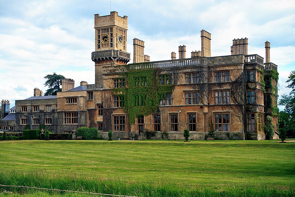
picture that I decided on, was this image of a big old mansion. My intentions
were to create a dark and mysterious scene, combining multiple images. The
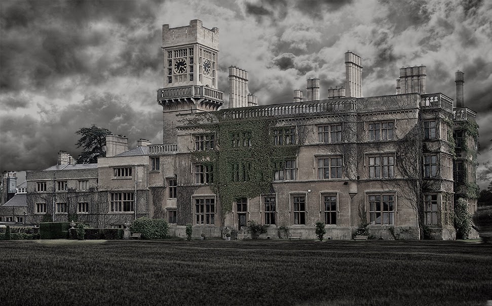
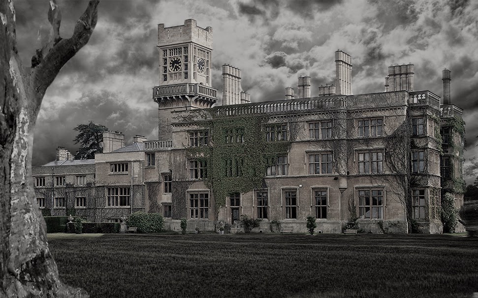
multiple images that I used can be seen below. I decided to composite images of
a dark cloudy sky, an old looking tree, along with a textured looking picture
of rain.
Having
previously never using photoshop other than on the Lynda Tutorials, I was
setting myself up for a challenge.
I began the
editing process by opening up all the photographs into layers on photoshop. I
decided the first thing I was going to do, is change the backround sky. By
doing this, I had to create a layer mask, of the mansion, to ensure that I
would be able to bring it to the front of the sky!
I did this by
using the quick selection tool. After selecting the area of the Mansion, I then
went on to use the mask edge tool to soften the edges, then contrast & the
shift edge tool. After doing this, I was fairly happy with how it turned out,
and made it into a new layer. From this point I used the magic eraser tool to
try and get rid of some of the rough edges that were still included within the
image!
Now it was
time to re-order the layers, to make sure that the new image of the sky went
behind the mansion. I did this by having the sky picture as the very bottom
layer. Above this, I had the
original
image of the mansion, and using the soft light option, allowed the sky to come
through as the backround!
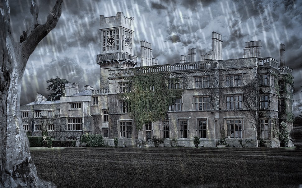
I used the
same steps with the other two images, to add the tree and aslo the rain to the
image!
I used the
Hue + Saturation Tool, the contrast tool, as well as the curves, to help blend
the image of the tree into the rest!


Although it
is far far far from perfect, I am relatively happy with the overall image! I
feel that I managed to create the dark and mysterious scene that I was hoping
to create, by using the different saturation and contrast levels, with the
layers combined.
To improve, I
would most definitely spend far more time on the edges of my layer, such as the
mansion and the tree, to ensure that they fitted the backround seamlessly. I
think doing this would ensure it looked more realistic. I would accomplish
this, by spending more time on the edges tool, along with erasing some of the
patches that still exist within the image! Overall I'm fairly satisfied with my
composition.
Semester 1 -
Assignment 1 - Big Me, Little Me Project
After having
around 5 weeks of learning the digital compositing module, we were given our
very first assessed assignment, which would consist of us using various skills
on photoshop that we have learnt, using layers, masking, colour correction and
matching, whilst also displaying our techniques of taking photographs, by using
lighting and green screen.
The title we
were given for this assignment, is Big Me, Little Me.
In basic
terms, we were asked to create a composition, containing only images and
photographs that we had produce ourselves, to make it seem like we are larger
or smaller than everything else in the image! We were given this image as an
example...

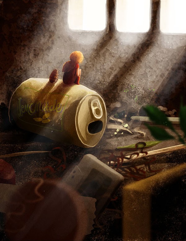
This is a
composition/illustration by Emilia Dziubak, and what we can see is a little
girl sitting on what appears to be a can of pop, in a very secluded area. The
image has a brilliant use of lighting and colour to create a dark, sad and
lonely place in which this girl is sitting in. In the foreground we can see
very familiar objects such as the cassette tape which is blatantly larger than
the girl, which in turn creates an image that is associated with the famous
novel 'The Borrowers' by Mary Norton.
With that
image in mind, It was time for me to think of how I would create my own very
Big Me, Little Me. This was not something that was going to be done overnight,
therefore I slept on the idea, and decided to carry on with the work the
following day!
I decided the
only way I would be able to create my idea's is to put them onto paper
initially. Therefore i began sketching out rough drafts of certain idea's that
came to mind when I thought about 'The borrowers'.
Bearing in
mind, that I am no artist when it comes to drawing, meaning my sketches, were
indeed very sketchy!
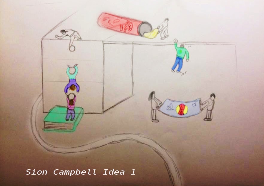
The very
first idea/sketch that I had created was this one...

This sketch
basically is to show a group of people who are attempting to steal some Pringle
Crisps that are conveniently left above on the desk. As it is a little out of
reach, the so called 'People' would be seen climbing the drawers, and helping
each other reach to the top of the desk.
Practicality-wise,
this image would be a fairly challenging one to complete. Although I believe
it's a strong idea, and has the possibilities of creating humour, It is indeed
one that would be difficult to make when it comes to using the green screen and
lighting. This composition would require much thought on the direction of
light, how it travels, and how it would affect the people in it, and as Im
currently not fully confident with using the lighting in the green screen, I
believe that this image is possibly a little out of my reach. I would be a
little out of my depth to try and create this. Perhaps later in the year when
i'm more familiar with the camera, and more confident with the lighting.
Here is the
second Sketch that I came out with as an idea...
This sketch's
purpose was to show an army of small people who are bravely helping a full sized
human being get to the hospital. The scene is set in a grassy environment,
which in the foreground you'd be able to see a full sized worm, with the
intention of emphasising how small these 'people' are.
Practicality-wise
I believe that this would be a challenging image to create, with a definite use
of multiple layers and masks to seamlessly make the images match up with each
other. Lighting is also a major factor that I would have to consider. I would
have to intentionally use backlighting on the images, to create the sense of
light that would be coming through underneath the leg of the human. I think it
would be a challenging task to create this image, but definitely one that I am
considering. I believe it is a challenge that would test my photoshop abilities
greatly, and push me further to better myself.
The Third
Sketch of and idea I came up with is this one...
This
currently is my personal favourite out of the idea's that i've been working on.
The image is to show a small couple who are having a romantic sunset date with
each other, without the knowledge that it's being taken place in a pub. I
believe that the image contains an element of humour, but is also keeping on
track with the original assignment which is to display our skills on compositing.
This image
again, is another one that I would have to concentrate highly on lighting, to
ensure that the lights would be hitting the correct area's on the two people,
whilst also ensuring that light is being correctly reflected through the gaps
that exist in the pack of cards. Although challenging, I believe that it's
do-able, and within reach of my capabilities. My only criticism at the moment
with the image as it stands, is that Im not creating many layers which is
definitely a skill I would like to demonstrate in my work. I would have to
alter this image slightly before going about it practically to contain this. I
believe this image would also display the use of the golden ration very well,
with the positioning of the little people.
The Fourth
Idea that I had Sketched was this one...
This
unfortunately is my least favourite so far, and I definitely feel I could've
spent more time thinking correctly on what I wanted this sketch to demonstrate.
For an unknown reason the title 'Bad Hair Day' had popped into my mind, and I
decided to incorporate that into a sketch. I decided to show a group of small
people playing around with a hairdryer that eventually turned out to be a bad
idea, resulting in them flying around off the table to the floor below.
Practicality-wise
I believe that the image is do-able. It would require multilayers, and a
various use of lighting to ensure that the images would fit seamlessly with
eachother. If I were to recreate this image using photographs, it would indeed
test many of the skills that I have been learning on photoshop during my
tutorials. It could also possibly contain good use of the golden ratio rule.
As I had
booked the greenscreen room for the 29th of October, I had a bit of spare time
in between to create a mock up of my idea, to see if it would likely work when
I went to shoot it.
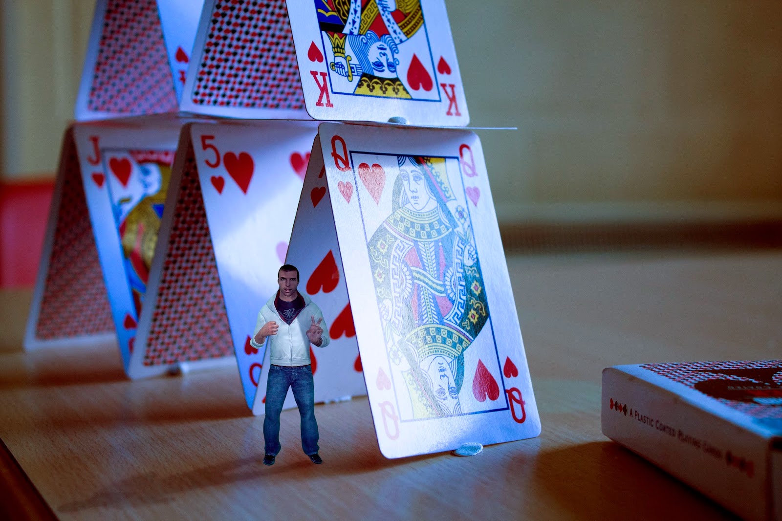
To do this, I
search for a random computer game character off the internet, and merged it
with my photograph that I had taken previously. The first thing that i had to
do, was ensure that I had fully got rid of the green backround on the
character. I did this by using the quick selection tool, the mask edges tool,
whilst also using the eraser tool just to get rid of any extra green pixels
that were still left. This is not the usual way of getting rid of greenscreen
backrounds, as usually you would despill the image to ensure that there is no
reflective green light upon the image, but as I was only creating a mock up, I
therefore decided to do a more simple a quicker way just to create an example.
The two
images that I had used, are the ones below.
 |
| Image From The Internet |
 |
| My Original Backround Image Shot With A Canon EOS 1100D |
 |
| A Mock Up / Rough Example of How I'd like The Final Composition To Be |
After
creating several idea’s for the ‘ Big Me, Little Me’ project, it was time for
me to move forward and pick one to
composite. After much thought, I came to the conclusion that I would do ‘Idea
3’ , which included the tower of playing cards.
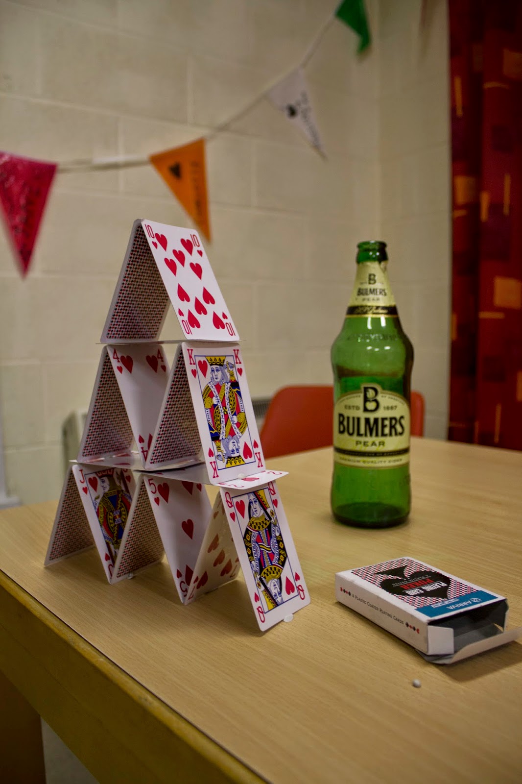
I chose this
Image because I believe it would be a rather simple, yet effective composition
that would not only display my various skills that I have learnt on the course
within Photoshop, but also would include a nice array of colour, and lighting.
I began the
process by using a Canon EOS 1100D, to take my very first images. I decided to
do various angles, at different heights and lengths to ensure that I had the
potential to get the right image to composite. I started taking photographs in
manual, but unfortunately had issues with the focus, and wasn’t able to work
out what I was doing wrong, therefore I had to use Auto Mode on the
camera. The images I took were shot in
RAW Mode, with a Bit Depth of 16 & Colour Mode RGB. To take these images, I
had to measure the baseline measurements, along with the height of the camera
as well as the angles of the photo’s were taken. This was a mundane task, but
vital in terms of creating an accurate composition.
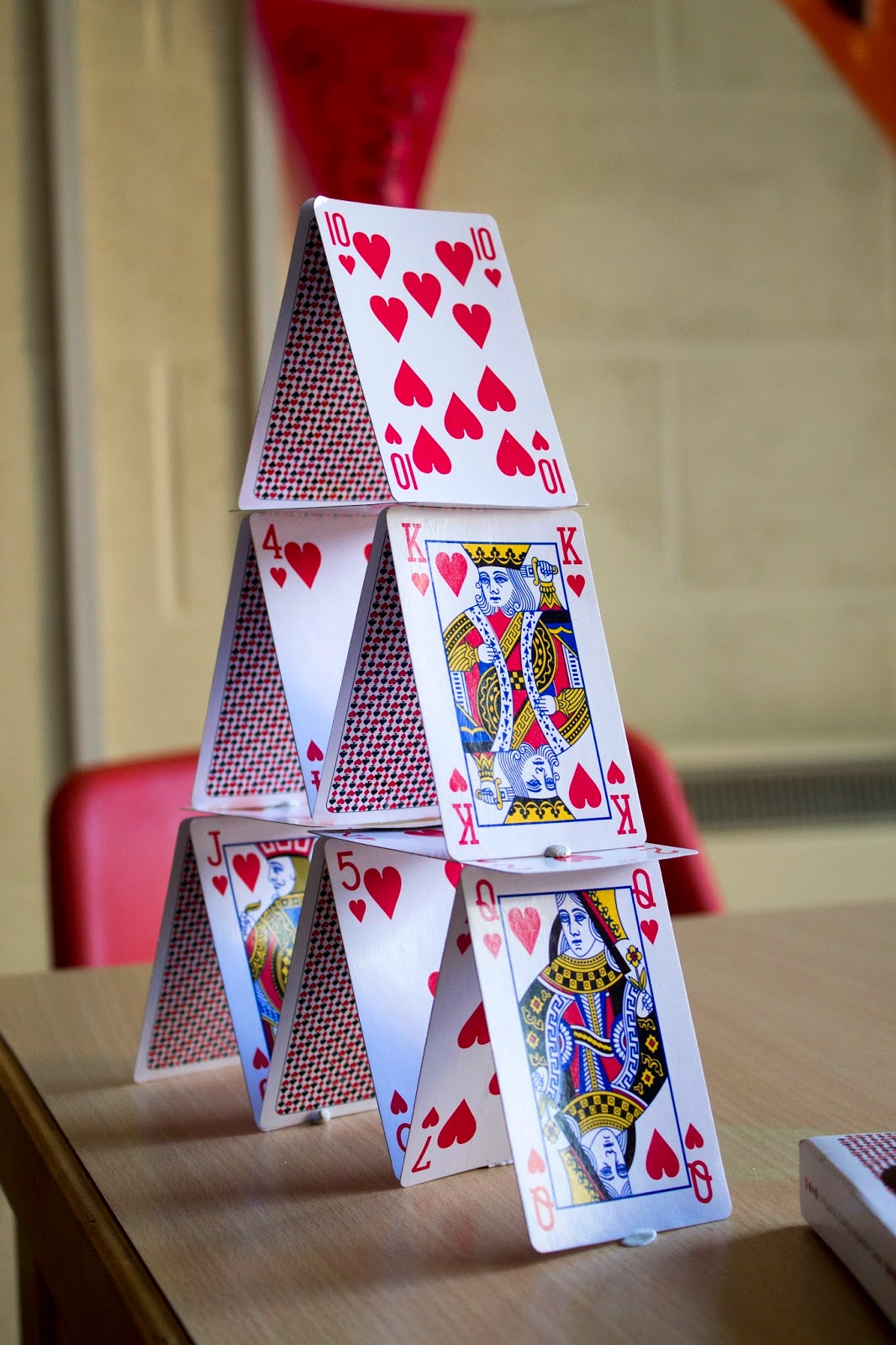
Here are
examples of the different photographs that I had taken using the Canon EOS
1100D…
From
these images, I decided to narrow it down to three of my favourites, then analyse
them to see which would be the most suitable for my composition.
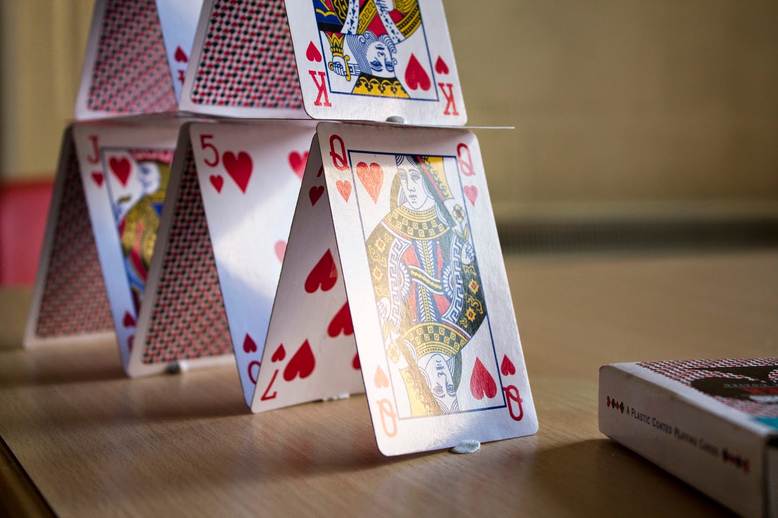
These were the three favourite images that I had taken…


From
these three Images, I started looking at
their possibilities in terms of lighting and colour to see whether they would
be suitable for compositing. Although I felt all images had their own potential
to become a composition, I found the third image to be more suitable than the
rest for this task.
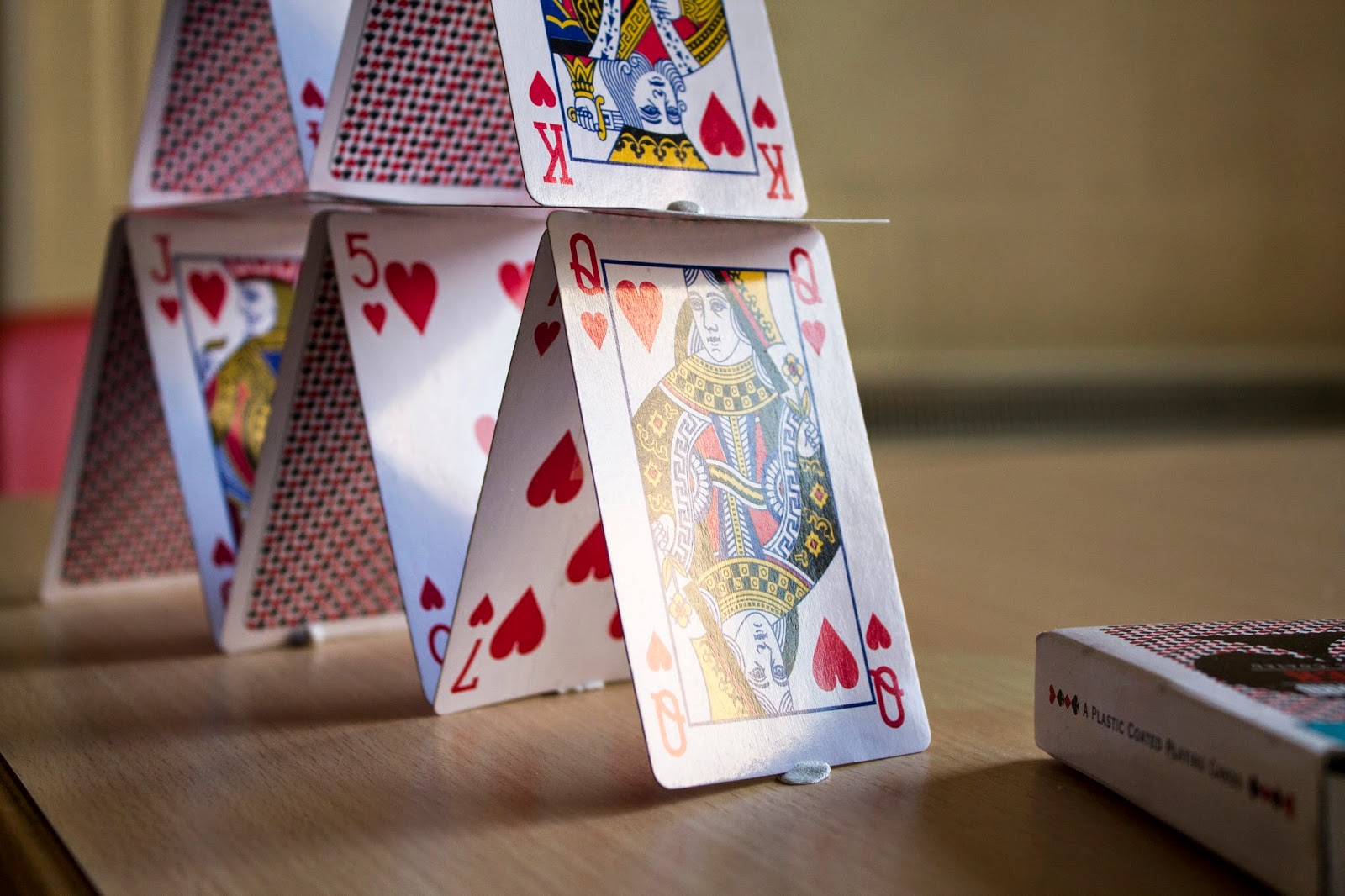
This was the image that I chose. I believe that it had the potential to
challenge me on my lighting skills in the green screen room, as well as getting
my angles and measurements correctly. Doing these two correctly, would allow
Photoshop to become easier for me, as I am not very experienced on the program,
and would have difficulty in getting the image correct if I hadn’t taken the photograph
to a great standard.
Here
below is the META DATA & EXIF DATA for the original background image that I
chose…
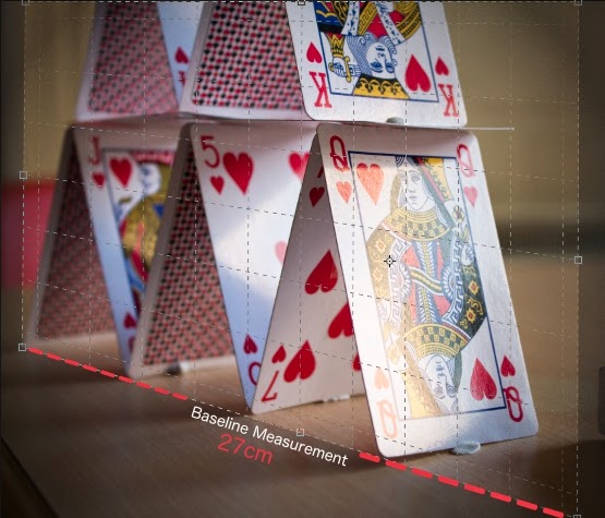
Here
are the measurements for this image that I had made whilst setting up to take
the photograph :
 |
| Image Not To Scale |
Once
having the ideal background image for my composition, it was time for me to
head to the green screen room to take the images that I was going to scale
down. As I am not very keen to be in front of the camera, I managed to get a
good friend of mine Giorgia Perini to be my model for this task, she was great
to work with, f which I very much appreciated!
All images that I took were in RAW MODE, by also using manual focus, ISO &
manual Exposure.
As I was not using any flash on the camera, It was important for me to get the
details right to have a decently exposed image.
To do this, I had to ensure that I had positioned the lighting that I had to
work with, in the correct area’s of the green screen room, to replicate any
shadows that were to be seen in my original background photo. I did have
difficulty in using my previous measurements, but I feel that overall it worked
out well in the end.
The idea was to make the image look as if Giorgia was hiding behind one of the
cards, therefore parts of her had to be hidden from view of the camera. To do
this we had to improvise a little, and I decided to use one of the green screen
floorboards representing one of the playing cards. Although entirely
improvised, it worked well, and was a great prop to work with.
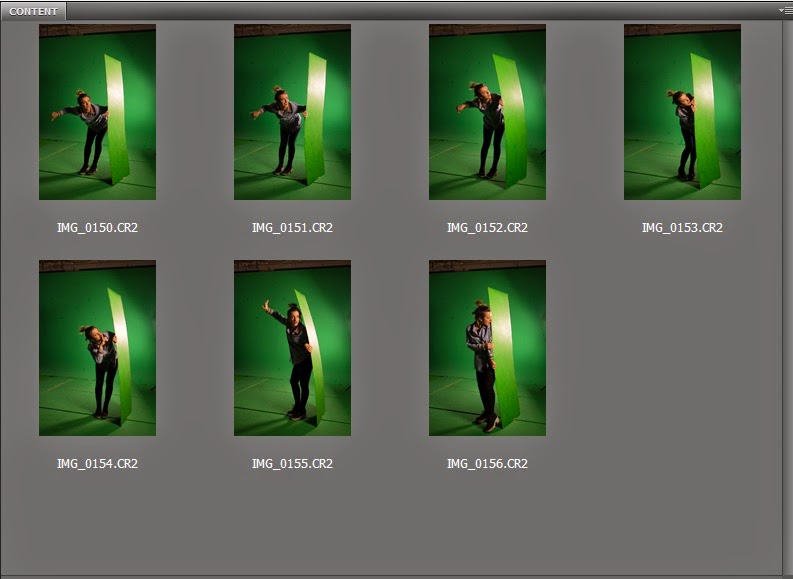
After taking multiple shots on the camera, It was time for me to reflect on the
images that I had, to see if they were suitable. These were the shots that I
had taken during the shoot in the green screen room.

I
eventually came to the decision that I would use this following image as my one
to composite with the backround image that I had taken. Below
is also the METADATA & EXIF DATA for this image.
After
completion of the greenscreen photos, it was time for me to display my skills
in Photoshop.
Therefore I
opened the RAW image that I was happy
with into photoshop ready for editing.
The first
step for me to achieve the image I wanted to create was to KEY the image. I did
this by using the channels palette, selecting the appropriate channel from the
RGB, and going to the Image drop down menu, and selecting the calculations
button.
From here I
had to select the appropriate layer from the dropdown menu, as well as the
appropriate channel that I was either going to SUBTRACT, ADD or MULTIPLY from.
This task had to be repeated several times, using different blends, Such as
Subtract or Multiply to get the desired colours chosen.
At this
point, you can see that I had Green Spill within my image that I had to get rid
of.
I would get rid of it by using the technique
that we learnt in our course called de-spilling. I started off by creating a
copy of the layer chosen, then removing the layer mask from it. Then i
transferred the layer mask from the original layer, by sliding it up to the new
copy. I then renamed the layer as De-spilled Layer.
Going back to
the channels palette, I then used the curves button and had to half the output
on the Red and Blue channel by 50%, which is the figure 128. To do this I made
a copy layer of each the blue channel and the red channel, then used the curves
button to lower the output.
From this, I
then went onto combine the red and blue channels together by selecting one, and
using the calculations option in the drop down menu. From there I used the Add
blend mode which then combined both channel layers together, which gave me my
average red and blue.
With my
average red and blue completed, I followed on to the next step which was to
subtract this new Average RED and BLUE from the original green screen layer.
This was done using the same calculations method, only using the subtract blend
mode instead. From that I had created my spill map.
From this
point I subtracted all the green, by using the same technique as before, by
using the appropriate channels layer. I copied the new de spilled green layer,
and pasted it onto the green channel. This worked pretty effectively in terms
of eliminating the green from my image, but still I had a few issues with it
that I had to sort.
I sorted the
issues out by using the eraser tool, which usually isn't the correct method,
but it worked for this particular image.
Once I had
finished with the despilled layer, it was then time for me to combine it with
my original background image of the playing cards that I had taken. This took
some time as I did have to change the scale, and also rotate it a little for it
to fit in with image correctly.
When I first
applied the De-spilled layer, the very first thing I noticed was that the
colours didn't match correctly with backround. Therefore I had to change the
colours to make it fit seamlessly. I did this by using the Vibrance tool, which
allowed me to change the saturation of the de-spilled layer.
BEFORE COLOUR
CHANGE
AFTER COLOUR
CHANGE
After getting
the positioning, the scale and the colour to match the backround, the next step
for me to do was to create a shadow that
would be realistic for the little person.
I had to acknowledge the fact that in the backround image the shadows
were all facing the left hand of the picture, therefore I had to match my new
shadow to the same direction as they were following.
To do this I
copied the original dispilled layer, then used various adjustment layers and
the saturation tool to get rid of any colour that existed. I then had to flip
the image horizontally then vertically therefore it would make a fairly
accurate shadow. I then had to rotate it to match up with the other directional
shadows, so it looked genuine.
By this point
I was relatively happy with the outcome of what I had, but decided to ask
advice and opinion of our lecturer for this module. From this, he brought up
some very valid points on how to improve the image.
From the
feedback, he mentioned about the colour temperature of the image, as the girl
wasn't matching up to the rest of the photograph, therefore it needed to be
toned down to a cooler colour.
He also
mentioned about a reflection that I had missed out, which involved the foot of
the girl. As the surface she is standing on is reflective, in a realistic
situation, her foot would be slightly reflected directly where the shadow
appear's , therefore that was something I should rectify.
Another point
that was brought up, is that when looking close up onto the girl the image
doesn't quite blend fully with the background. The original background had far
more natural grain, where as the super-imposed image did not. Therefore I made
sure to add more grain to the image of the girl so it would blend seamlessly
into the image.
The final
point that was brought up, was that he would like to see what the girl was
afraid of, and what she was looking at. Therefore I had to take one last final
image to composite into it. I decided I was to incorporate a large face looking
down on her, to emphasise on how small the girl is.
Here is the
EXIF data of the new image that I was to incorporate into the composition...
For this
image, as I was short on time I wasn't able to use the green screen to take the
image, therefore when it came to editing I had to use the quick selection tool
to remove the background. I noticed instantly that the colours weren't accurate
enough to fit seamlessly in the composition. I had to use the channel mixer
along with the vibrance tool to make it more accurate. I also skewed the angle
of the image to make it seem like she is looking down on the girl. To get it as
close as the original image, I used a final levels tool just to create a slight
shadow underneath the chin area, with more light on the nose.
By doing so I
managed to get this outcome below...
As I was rather pleased with the outcome, I
decided that I felt that I only needed to add final touches to the image, the
minute details.
Some of these
details included creating a reflection onto the pack of cards that was in the
foreground as it was naturally reflective. So as you can see in the image
below, I added a subtle layer over the image that was flipped horizontally, and
vertically, then with the opacity and transparency on a low figure. This can be
seen in the image below...
I believe
that adding these small details are vital to ensure that the image was as
realistic looking as possible. Other subtle changes were made such as the
adding a shadow onto the desk that would be created by the large face looking
down upon the girl. I did this by selecting a realistic area on the desk, and
changing the exposure to create a shadow, then blending it in using a gaussian
blur.
This can be
seen in the image below...
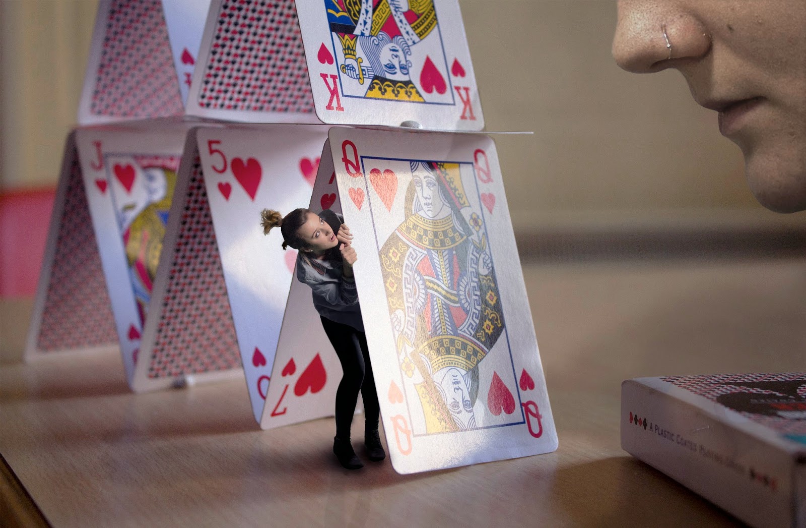
FINAL
COMPOSITION

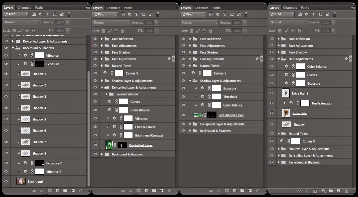
Here are the Layers Palette for the composition...

SECOND DIGITAL COMPOSITING ASSIGMENT
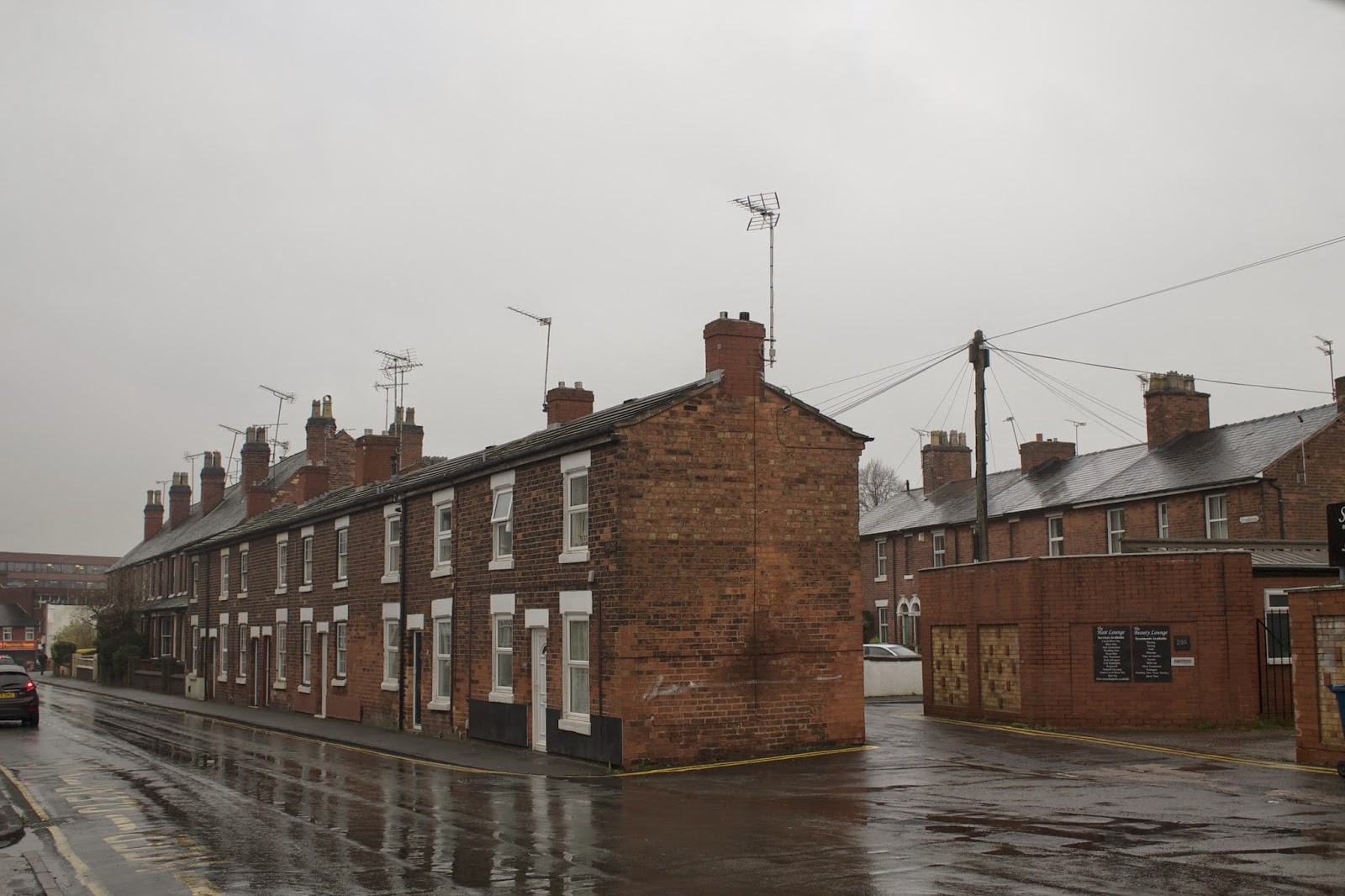
For our second task for Digital Compositing, we were asked to do a 'Street Scene' of our own choice. With this task, it was expected of us to display all the skills that we have so far learnt on Photoshop, by creating a realistic street scene, using our own image as the backdrop, and then the incorporation of multiple stock images from the internet.
As I was rather excited for this task, I went instantly to think of idea's, and the first one that came to my head was the industrial revolution. Currently living in Stafford, the town centre has many buildings from the victorian era, which would be perfect to create a Victorian-esque scene, depicting the industrial revolution that took place many years ago. Providing I took a well com-positioned background photograph, I felt that I had many elements I could work with!
Some of the elements I visualised included...
Victorian Chimneys
Horse & Cart
Lamp Posts
Victorian Factories
Layers of Smoke & Dust
Victorian Characters With Top Hats ect...
Here is a simple mock up of the idea I had in mind for the project...

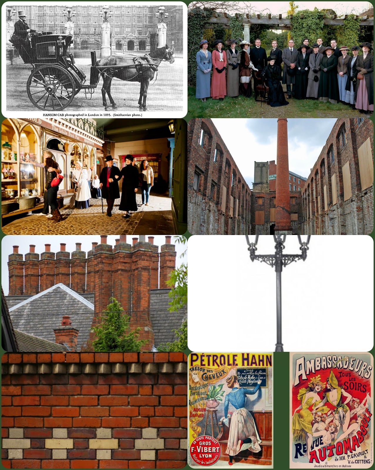
Here are images from the internet that I used as a part of my inspiration for this Task....

Here is the original image I took for my street scene...

Here is the final image...
References - Direct Links to each image used :
Chimney 1
Chimney 2Chimney 3
Old Fashioned Car
Wall Poster
Power Plant Tower
Cloudy Sky Background
Steel Factory Port Talbot
DIGITAL COMPOSITING TUTORIALS COMPLETED
Here are the outcomes of the tutorials done for Digital Compositing through the LYNDA WEBSITE.
 My Names Sion Campbell,


